Changes Mirrored in Colour Palettes –
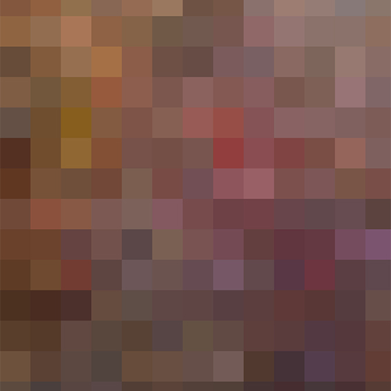
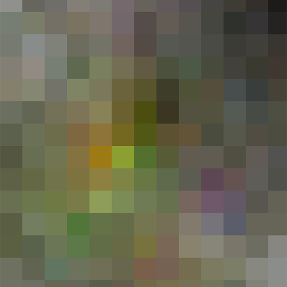
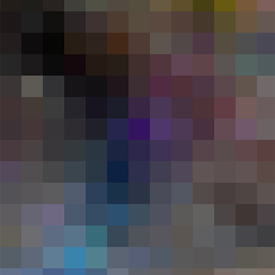
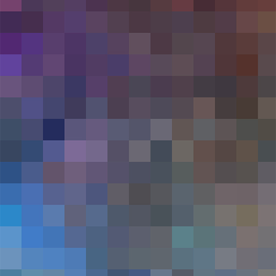
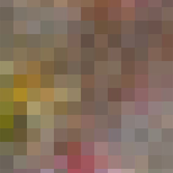
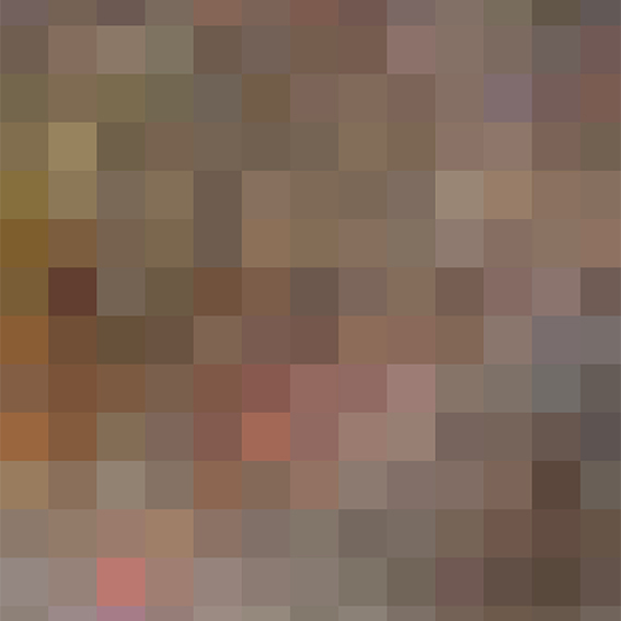
As I reviewed the requirements for various learning objectives, I wondered if I could visually depict the transformation or evolution of my work. I recalled an early blog post where I explored my phone’s camera roll using an app that compresses images into a heat map. I then further pixelated these images in Photoshop to break them down into their constituent colours. This process was documented in a blog post called ‘Starting an MA’. It was actually only my second post, so it is highly representative of what I was doing 2 years ago. I wondered what my very latest camera roll images would look like now compared to those of 2 years ago?
Colour Photo Maps
The following before-and-after color maps illustrate the evolution of my color palette. The images on the left depict my pre-2022 colour choices, while those on the right cover the period from the start of my MA in Fine Art Digital up to the present. A significant shift towards a lighter colour palette is evident, reflecting a change in my artistic approach over the last two years, with much of my recent work being notably monochromatic. It would be intriguing to repeat this analysis in a few years to observe any further changes.