Time & Travel
It’s Better to Travel Than to Arrive? – This was a quote I stumbled across earlier this year. Unfortunately I’m not sure who said it, but given I was travelling to London I decided to use it anyway. This was the first of two trips to London this year. As I am a keen photographer I decided to document anything interesting. I couldn’t help but notice that the light was particularly beautiful at Newton Abbot train station. However this was nothing compared to the beauty of the ceiling structures at Paddington train station. Below is a small collection of images including the view from my hotel window.
A Few Random Shots with My Smartphone
Unfortunately I had decided to leave my DSLR at home. However, should I ever decide to shoot Paddington station again these are the kind of shots I would take with my DSLR. My smartphone is great for this activity, but maybe not so good with its pixel count.
The Most Underwhelming Time-Lapse Ever!
At the start of this blog I muted – it is better to travel than to arrive? I’m not sure that is strictly true, but just in case, I decided to time-lapse the journey on the way home. This was not my brightest idea! I had no way of securing my phone against the window. I had two choices – miss out on the time-lapse, or strike the pose below. I opted for the latter.

The Result…
To say I was disappointed with the result would be an understatement! There wasn’t enough detail as the smartphone had dropped so many frames to conserve space. A good lesson learned from this experience was – to bring my smartphone tripod with me next time. I found it is also a good idea to break up the time-lapse into smaller clips. This means less frames are dropped by the phone. Hopefully this will result in a more detailed film next time.
Problem Solving
I absolutely hate the idea of wasted effort. I’d just spent the last three and a half hours in an arm lock, only to achieve probably the most nondescript time-lapse I’d ever created. Therefore I needed to think creatively to avoid the whole exercise being a complete waste of time.
I have an interest in time and the passage of time and this is why I tend to build time-lapses into my work as often as I can. When I ran the time-lapse back I noticed how different colours flashed past. It made me wonder what the colours would be like at any given point in space and time along the journey. The time-lapse was around 30 seconds long so I played it again. However, this time I took a series of 30 evenly spaced screenshots. This way I was able to capture a little slice of space along the journey.
Small Slices of Time and Space in Colour
The day of travel was very rainy and the light levels also poor. This meant there was a lot of motion blur on some of the resulting screenshots. For this reason I decided to reduce each screen shot into pure blocks of colour. I have included a few examples below to show the original screenshot next to the pixelated image with blocks of color. I had tried a similar technique with images on my phone and the results were quite revealing. Some months I seemed to shoot in one particular colour which was quite interesting. I was curious to see what patterns would emerge from the beginning to end of the journey.
Turning Points in Time to Colours in Time
The images comprising the time-lapse were not great in terms of quality. Therefore, I didn’t want to use them. However, broken down using pixelation, their simple colours were much more interesting. The image sliders below show the original poor quality screenshot images alongside the pixelated images with their constituent colour blocks.


Where Next?
I changed each screen shot into a pixelated image. A selection of these can be seen on the contact sheet below. Now that I had my 30 little timeslice swatches of colour, the question was where to take this experiment next?

Stop and Start Motion
I needed to find a way to display my colour timeslices in a way that made some kind of visual sense. Each individual colour swatch represented a point in time and it was important that this point in time was chronologically represented in the space along the journey.
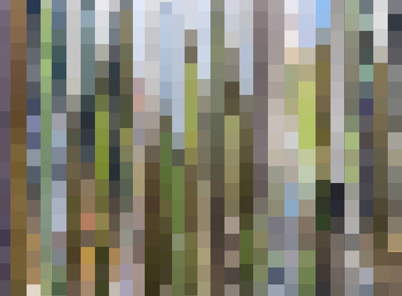
In order to get around this problem, I decided to take only a small part at the beginning of each colour swatch image. I then overlaid this image on top of the next one and so on and so on, leaving a part of each image showing underneath. This way the colour swatches were not only in chronological order they could also be displayed. Below is a visual representation of 30 timeslices of colour in chronological order. This is a colour representation of points or slices in time along the train track, all the way from Paddington station to Paignton station. There are thirty points in time – a colour snapshot of both the urban and countryside landscape through time. Working from left to right on the image below, the journey begins at Paddington Station and ends at Paignton station. Both of these slices are represented.
A View from a Train Window
Following is a short animation of the timeslices. Sometimes as we gaze through a train window, depending upon focus, the scenery outside may appear static or it may appear to whiz by. I felt that the video below in some respects actually looked like the view from a train window. As each coloured timeslice comes into view and is then superseded by the next slice, it remains frozen in time. The future continues to happen as the past becomes fixed. I think the video represents this well.
Killing Two Birds with One Stone
I was quite pleased with the resulting video above. I felt that I had taken a completely failed idea and hopefully turned it into something much more meaningful. Looking at the composite image of the colour timeslices I began to think about watercolours and whether as a landscape representation, this image could be made into a watercolour. I thought about grabbing my watercolours to experiment, but then I thought there must be someone who has produced a Touch Designer digital watercolour tutorial – and guess what?…
Watercolour Tutorial Timelapse
Here’s me working through my watercolour timelapse tutorial. I was very annoyed that time appeared to stop part way through, (notice the clock). The clock battery issue has now been solved.
The Resulting Watercolour Generative Art Video
I was quite pleased with the video, because not only had I managed another tutorial, I had also managed to generate some digitally produced watercolour images.
Watercolour Time Slices from Paddington to Paignton
Continued Experimentation
Although I was quite pleased with digital watercolour experiments, I still felt that there was some mileage in further experimentation. I began to wonder what the coloured timeslices would be like if they were warped, curved and bent? This to me represented a distortion in time, a warping of time and a warping of the landscape.
Distorted Colour Slices of Time
Stills from the Video
What If?…
Just as I was above to wrap up this blog, something suddenly struck me! The train was moving and the points in time static. What if I could transfer the timeslice design I created onto something that moves while the design stays static? I came up with the idea of a shoe. A shoe is in motion when it’s wearer walks. However, any design on the shoe remains static. I had a spare half an hour, so I shot one of my shoes and with a little Photoshop magic I came up with the following design.

So, my shoe image probably wasn’t my Photoshop finest hour, but I think it is easy to see the general idea? I then thought why stop at shoes, why not have a small product range? Below are some examples of how a timeslice range of clothing might look. I have included various items including t-shirts, hoodies, cushions, mugs etc. They all carry the Paddington to London timeslice design. What I particularly like about these designs is the colours of the timeslice itself. I did not alter the colours from the original Paddington to Paignton timelapse video. This was to preserve the accuracy of what my smartphone was seeing and recording. Most of the colours have very ‘earthy’ natural looking tones. I like this because it could work as a design for environmental, climate change or nature oriented projects.
.
The Next Step – Environmental Fashion?
The timeslice design and everything that has subsequently sprung from it, had it roots in the environment. These were tiny slices of time along a trajectory expressed through blocks of colour. Working with this idea I produced the following range of products.
I knew it was time to stop when…


Conclusion
After a very shaky start with a poorly shot timelapse, I hope that I have proved that interesting images can still be produced with a little creative thinking. I feel that there are still a number of creative avenues I could explore using the notion of slices of time and space and motion. I think that this is something I would definitely like to explore further.
Tomorrow I am off to London again as part of a college trip, so once again there may be a pause in my writing. I am hoping to explore a number of galleries and I intend to report back on my findings. I certainly don’t think I will be shooting an ‘out of the window’ timelapse on this occasion, having learnt my lesson from last time.
Until Next Time…
The more I consider the notion of colour and timeslices the more I like the idea. I certainly think this may be an idea to take forward. In the meantime I will end with a few collages from the project and my all time favourite image at the end.