Hidden Light and Colours –
I particularly admire the work by Jason Schulman. I discovered him last week and ever since I stumbled across his work I have been absolutely ‘sold’ on it.
Schulman records light with his camera across the entirety of a film. His work has been incorrectly likened to that of Hiroshi Sugimoto’s ‘Cinema Halls’. Schulman explains more about this in his interview with Dominic Jaeckle. Although the process of recording the entirety of the film is quite straightforward, it appears that Schulman is somewhat a pioneer in the area of recording films.
I am a huge fan of slow shutter techniques, which I believe were used in the creation of both Sugimoto and Schulman’s images. Therefore I could not resist experimenting further using the work of Schulman and Sugimoto as a starting point. I find the notion of light being recorded and compounded into one image very appealing. Generally we never see light compounded in such a way so as to reveal a multitude of hidden colours and tones. Throughout my project I have been searching for the ‘hidden’ in whatever shape or form that may take. Schulman’s work reveals the beauty hidden in compounded light. This takes the form of colours, abstract shapes and tones recorded across entire films. I wondered if there could be an additional form of enquiry to pursue here?
Both artists were working on the usual (visible to the human eye) spectrum of light, but what about infrared? What about compounding hidden wavelengths? I decided to try some early experiments, but not with the visible light spectrum. Instead I decided to record my television using infrared. I have owned a Hoya R72 infrared filter for many years. In fact infrared photography is not new to me at all, but recording the light from my tv screen most definitely is. Below is my first experiment.
Infrared Photography – Light Compounded from a TV Screen
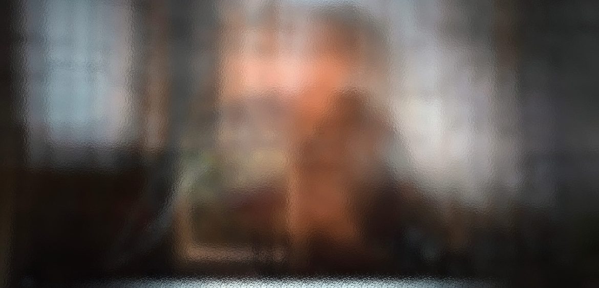
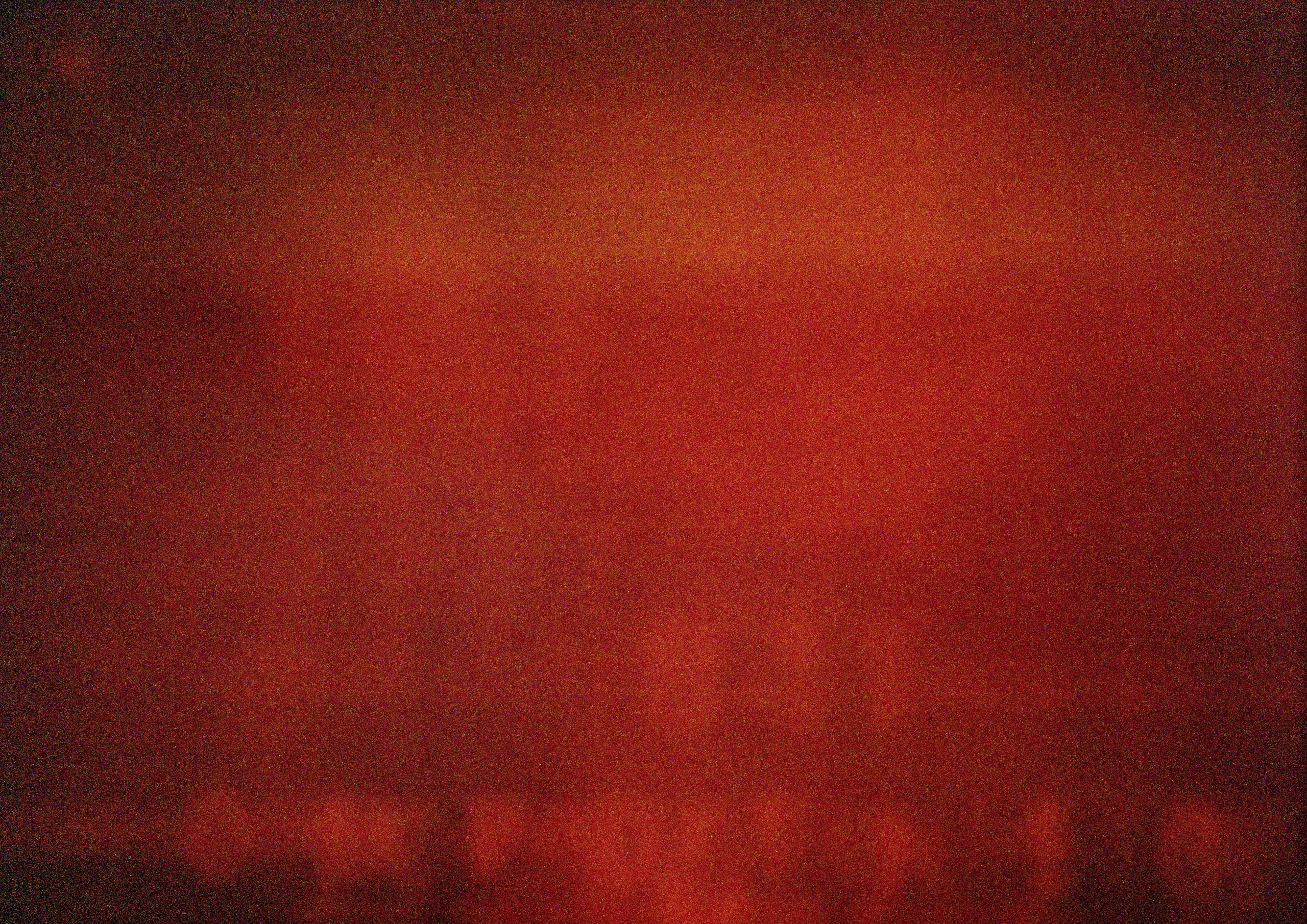
The following image was the first image I shot of my tv screen. It is normal for infrared photography exposures to return orange/brownish and light cream colours. The beautiful infrared photography that normally appears on the internet has usually gone through a process of channel swapping in Photoshop to enhance and change colours. The image below is called as a SOTC (straight out of the camera) image. I have not altered it or enhanced it in any way. I was particularly intrigued by what seems to be a number on the image. Unfortunately because my shutter wasn’t performing very well on the timed setting, it was impossible for me to tell the duration of the actual exposure. However, I think that there may be some ‘mileage’ in exploring the slow shutter technique further. This is (in my opinion) the technique that Schulman used to produce his long exposures of films. However I suspect that Schulman will have used an ND filter as opposed to an infrared filter that I am using. His technique varies from that of Sugimoto in that Schulman is recording what appears on screen whereas Sugimoto used the light from the screen to illuminate his cinema/theatre halls. I am using the former technique because I want to record the light coming from the screen in this experiment and not the illuminated screen from it.
An Infrared Image of a TV Screen (Experiment 1)
Problem Solving
It wasn’t long before I ran into a few problems. I’m not exactly sure why but the ‘Timed’ feature on both of my Nikon cameras would only allow for my shutter to remain open for around 20 minutes. I haven’t yet had time to fully investigate this, but in the short term it means that I am limited to only short durations of an open shutter to record light.
Although I began my investigation with infrared photography I soon switched to my ND (neutral density) filter so that I could accurately record the visible light. I also had my suspicions that the infrared filter was just too dense and dark and thus confused my camera into prematurely shutting down. However, this time as well as swapping over to an ND filter I was also searching for a shorter duration. I began to think about something meaningful that I could investigate using Jason Schulman‘s slow shutter technique. At this point I began watching YouTube for inspiration. Strangely enough, just at that moment I caught sight of a party political broadcast by Sir Keir Starmer leader of the Labour Party. At that point I realised that party political broadcasts could be the ideal duration (in terms of length of time) for my experimentation. I also felt that they may offer an interesting approach or angle to my investigation.
I searched YouTube for as many party political broadcasts that I could find. I’m not very political I and don’t tend to follow politics. Therefore, I hope that I got the balance even between right and left. I also added an extreme in there for good measure, I don’t have to mention them by name. I found all of the broadcasts quite hard listening and wished I had turned off the sound. I find empty promises increasingly annoying – it’s becoming quite nauseating the older I get so this is why I don’t tend to engage anymore.
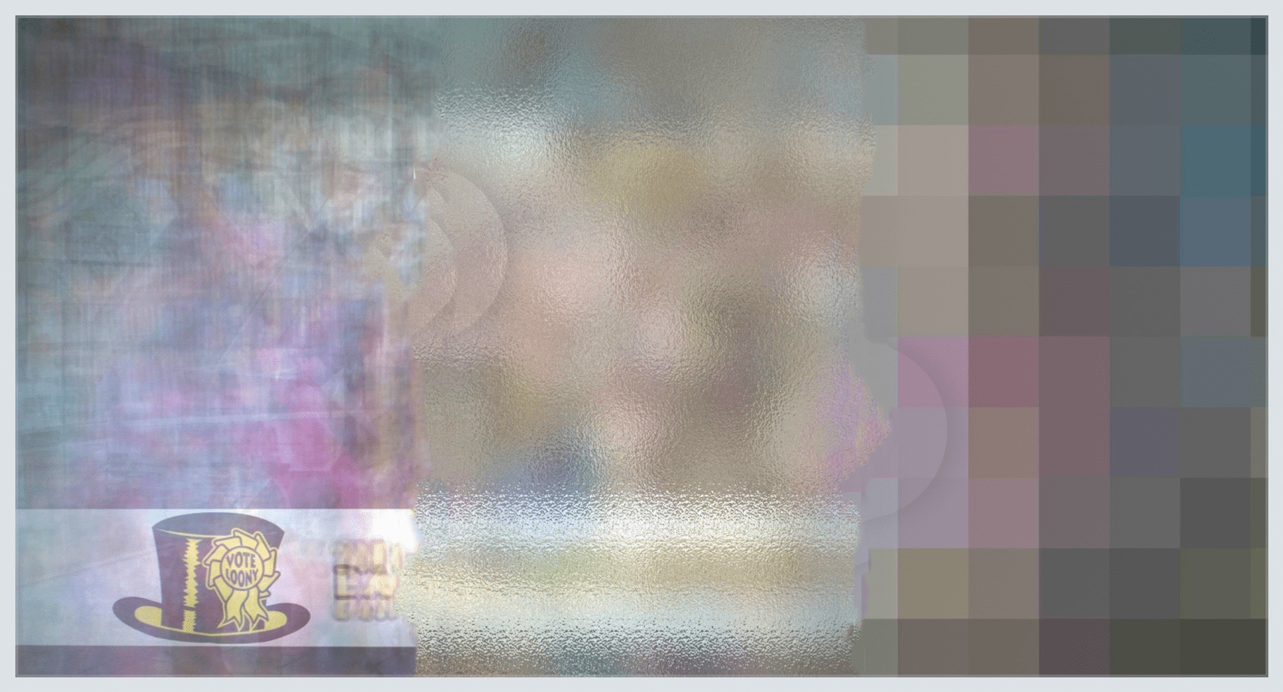
However, I was keen to see how Ai reacted to my images. Below are 13 sets of images. The first image is the original slow shutter image of the full duration of the broadcast. The second image is a digitally frosted version of this so that any identifying text and logos are blurred out without significantly altering the look and colours of the original. Finally the third image is the original image broken into its constituent colour blocks to see if there had been any ‘tell tale’ colours inherent in the original image. For example was the Labour image predominantly red or the Conservatives’s image predominantly blue?
The Results from the Slow Shutter Experiment
3 image addon required to activate 3 image slider
3 image addon required to activate 3 image slider
3 image addon required to activate 3 image slider
3 image addon required to activate 3 image slider
3 image addon required to activate 3 image slider
3 image addon required to activate 3 image slider
3 image addon required to activate 3 image slider
3 image addon required to activate 3 image slider
3 image addon required to activate 3 image slider
3 image addon required to activate 3 image slider
3 image addon required to activate 3 image slider
3 image addon required to activate 3 image slider
3 image addon required to activate 3 image slider
Midway Evaluation
I felt that the original images were very interesting but because some of the text remained on screen during the broadcast this meant that the party was identifiable. Although this is not a problem in itself, (I think it adds to each original slow shutter image), I wanted to do some primary research to see what colours and abstracts people preferred. Was there a clear pattern emerging? I am currently running a poll on my website exploring this concept. For this poll, I ran the frosted images through an Ai image to video generator to see what the Ai thought it was looking at. I deliberately did not ‘feed’ it any text prompts to help it out, I simply allowed it to decide what it thought I wanted from the seed images I supplied. I then screenshot the most abstract images/frames from each Ai video generation and asked respondents to choose their favourite image. Currently, the last time I checked, the Lib Dems seemed to be doing really well. Looking at the images above I think that the 3 different collaged images into one image namely: the original image, the frosted image and the colour mosaic image could be digital artworks in their own right. Below I have included my favourite for illustration purposes. As a development I would remove the arrows and the white lines. I have also included a very ‘quick and dirty’ edit of this to show how it may look as a digital art piece or a print.
With Lines

Without Lines
Next Steps
Now that I had images created from the compounded light of a variety of party political broadcasts, I was satisfied enough using Jason Schulman’s technique that I had produced something hidden. As humans we don’t typically see light compounded in this way so I was happy that I had produced something that was normally imperceptible. I now wanted to add an extra layer to that and find out what Ai image to video would make of these blurry images. Below are the results of my investigation. I have included an anonymous video containing all of the political party broadcasts as interpreted by Ai image to video from my slow shutter seed images. Then below that I have included a video that shows which short Ai generated clip belongs to each political party.
Ai Generated Audio
Ai text to image and image to video don’t just stop there. Indeed, ai tools seem to be increasing at an exponential rate! While putting together this blog post I stumbled across Mubert. This is a feature rich set of tools for producing ai music. Given that I was investigating different political parties, I felt it would be useful to also let the ai generate the music for each one. When using Mubert an option is given to input text and then the ai interprets this and generates music accordingly. I can thoroughly recommend this program! All of the music generated in the videos below come from ai that was ‘fed’ text such as ‘The Monster Raving Loony Party or The Socialist Worker Party etc.
Party Political Broadcasts (Anonymous) as Interpreted by Ai
A set of anonymous political parties re-imagined by Ai using slow shutter images absorbing all of their light by being taken across the whole of each political party broadcast. Music was Ai generated using text prompts of the name of each political party.
Party Political Broadcasts (Revealed) as Interpreted by Ai
The description is the same as the video above only this time the political parties have been revealed. Perhaps before viewing this video you might like to have a guess at what each one is? There are 13 parties in total and here’s the list of them in random: SNP, Socialist Labour, DUP, BNP, Reform Party, Brexit Party, UKIP, Monster Raving Loony Party, Heritage party, Labour, Lib Dems, Green Party and finally the Conservatives.
A Lighthearted Look at the Results
It’s clear that the Ai image to video generator was simply trying to make some kind of sense of what had been presented to it. The decision making process of the Ai music generator was less obvious. How would anyone human or machine musically interpret the words ‘The Brexit Party’? However taking the generations from each party in turn here is my analysis.
The Labour Party – the software generated what looked like an umbrella with some red tones but other than that I struggle to make a connection. The music was quite upbeat.
The Conservative Party – predominantly blue tones with cloudy skies. The software clearly identified both the traditional conservative blue colour plus the mood (cloudy skies) of the country at the moment – maybe?
The Lib Dems – nice upbeat music but I couldn’t really get the fruit connection other than maybe we will have an abundance of fresh fruit if we possibly rejoin the EU under their rule?
The Green Party – there was certainly a lack of anything green in this clip and there was some kind of house building going on. Maybe they are eco houses? The music didn’t seem to fit too well either. It wasn’t very upbeat.
UKIP (Wales) – this one was an easy one for me – it’s someone in rural wales looking out over the valleys.
The Monster Raving Loony Party – definitely a surreal almost trippy landscape. Nice upbeat music.
The Heritage Party – this one was quite easy – lots of people walking around, maybe symbolic of groups of people, ancestors, family etc.? Or maybe that’s just a very tenuous link?
The Brexit Party – this clip has quite somber music and the video could be likened to the sea. Could this be a visual metaphor the UK as an island cut off and surrounded by sea?
The Reform Party – this is clearly someone who keeps reforming and refining their look. Is this person changing their face to suit the mood? The music was upbeat and seemed to work well with the video.
The British National Party – I’m not quite sure what to make of this clip. It seemed to really stand out on a number of levels. I deliberately included this party to add an element of controversy. If art can’t offend then what can it do? The music was quite jarring and disjointed. Watching this clip I began to imagine the ghosts wearing white pointed hats, but strangely I can’t think why? Well actually I can, but that’s a conversation for another day.
The DUP – there’s Arelene with her broomstick (only joking).
The Socialist Labour Party – I’m not sure why the Ai manifested a person of colour in relation to the seed image but it’s nice to see and maybe it’s because this party is both inclusive and diverse. I do not know much about the Socialist Labour Party, so it’s hard for me to say.
The SNP – recently Nicola Sturgeon announced her resignation. This video puts me in the mind of her wandering around her bedroom all while pondering her next career move.
Conclusion
Interesting results. Quite a few tenuous links, but at the same time interesting to see what the Ai made of the seed images. I particularly like the slow shutter technique. The idea of recording hidden light appeals to me. So too does discovering what Ai tries to make of it. This was a very long but enjoyable project. It was quite revealing in many ways. I also think that it answered my own brief of working to discover a human, digital and Ai form of art combined that covers hidden elements. The hidden element here being the compounded light of the Party Political Broadcasts not normally visible in that form to the observer. Overall I think this technique has development potential especially in terms of bringing into the physical.