A Physical Derive –
Shortly after we had our Zoom Session 18 I decided to try out the concept of a physical derive. My DSLR camera was at work, so I headed out armed with only my smartphone. I had no preconceived ideas about where my walking or my thoughts would take me, I just decided to physically wander.
On reaching the end of my street I was greeted by the huge sign for our local Funeral Director plus a plethora of road traffic cones and more signs around it. I began to wonder about signs? At first I thought about taking photographs of purely negative signs, but then I thought, what about information overload? Even in a short walk to the end of my street I had already encountered many signs packed with information. I began to wonder what the ratio would be between negative and prohibitive signs and more positive and informative signs? Brixham is a small town and in my opinion ‘rammed to the rafters’ with signs, would a busy city centre be better or worse as a comparison in terms of signage? Then I began to wonder if there was a correlation between the variety and number of signs weighed against mental health and the hazards of a potential information overload? I also asked myself a series of questions: are we as humans becoming ‘blind’ to these signs? Were there as many signs 20, 40, or even 60+ years ago? Could the signs be limited in some way to reduce the sheer volume of visual noise/clutter that they were creating? Should more signs be allowed or should we be limiting the information overload?
Many of the signs I encountered were traffic signs and as such essential. However, there were many signs by the town’s harbour (Brixham Harbour), that were continually repeated. I suspected that if the message wasn’t absorbed the first time then by the 5th time hopefully it would be. The art pieces I have created as a result of this derive show what appears to be the same sign repeated multiple times. In fact no signs have been repeated at all. The imagery on each sign may appear the same but no sign is repeated. Each image represents a physical sign. I walked on foot for around three hours, travelling around 3 miles and during that period I encountered 300 signs which I photographed with my smartphone. Below is the route that I took mapped out together with 50 of the signs I saw during that journey. I would have added all 300 hundred signs to the journey but unfortunately 50 images was a limitation of the software.
The Route Around Town – (3 miles, 3 hours over 300 signs)
3 Miles and Over 300 Signs
I thought that all of these signs might lead to a hybrid human, digital and Ai computer art piece. The concept was born out of the sheer information overload of signs during a short 3 mile walk in the pretty fishing town of Brixham. The beautiful landscape was littered with all manner of signs, some encouraging, some supplying information, some prohibitive and some even quite threatening. However, seeing them as a composite was revealing as they became pure ‘visual noise’ – a ‘blot’ on the landscape. This YouTube short aims to capture the plethora of signs recorded on a short 3 mile journey and further in this blogpost I use Ai and digital art to weave them into something more abstract. Three hundred signs were captured in just under 3 miles. Information overload?
Time of the Signs – In Your Face!
When all of the signs were assembled into one video, the level of information bombardment and visual noise in such a small area and time scale becomes quite overwhelming. I produced the following short video/animation piece to highlight what we are all faced with on a daily basis. However, until it is presented in a certain way I suspect that many people haven’t even considered it. The piece below incorporates over 300 signs from the project. What I find most striking about the video compilation is how it is relenting. At a point that the viewer may think it stops the music picks up again and the bombardment continues. The music was also carefully chosen for the piece.
Analysing the Signs
I was very curious to perform some form of data analysis on the types of signs and information I encountered on my route around town. I broke down the information and signs into 4 distinct categories. Some of the signs conveyed useful information and/or covered pleasant topics like ‘You may kayak here’. There were also warning signs conveying cautionary information. Some signs were simply road signs and others were either prohibitive or negative. Therefore I assigned the sign and information categories comprising 314 signs in total as follows:
- Positive Info (90 signs)
- Negative/Prohibitive Info (139 signs)
- Cautionary Info (22 signs)
- Road Signs (63 signs)
Below is a graphic showing the percentage of signs falling into each category.

Taking a closer look at the data it is easy to spot that negative and cautionary information signs far outweigh the more positive informative signs when removing the neutral road signs. Indeed the cautionary and negative information signs take up approximately two thirds of the pie chart as opposed to only one third of positive signs. It is interesting to observe that in our environment we are being bombarded with negative messaging more than positive messaging. Could this be having an effect on individuals and if so what might that effect be?
Showing Signs in Context
The video below shows the signs in context. It’s not quite a powerful as the video above showing the signs isolated in circles, however in order to add context I have added the signs in the environments that I found them.
Complete information Overload
It wasn’t until I sat down to compile and edit my sign photographs that I really gave signage much thought. Perhaps many of us are blind to the vast amounts of information being thrust upon us a daily basis? It wasn’t something that I’d particularly taken much notice of in the past. However, when faced with editing and compiling over 30o signs I became acutely aware of just how much information we are absorbing from our environments alone. This doesn’t even take into account smartphone, computer, tv, tablet, newspapers and book usage. As a response to the way I felt about this information overload I made the following piece. I describe it as follows:
‘This short was generated using Touch Designer. It aim is to show a bombardment of signage that we are all subjected to on a daily basis. It’s visual noise – we are surrounded by visual noise. The image is deliberately ‘jarring’ while juxta posed against more pleasing music. My personal belief is that we are becoming thrust into an age of mental over stimulation but we barely notice it anymore until perhaps it is pointed out.’
The following digital piece, comprises a video of the 300 plus signs added to ‘Touch Designer’ software. Using a dynamic texture grid the sign video becomes a ‘generative artwork’. The image continually and randomly regenerates.
Early Experimentation
Following are some early experiments I produced using the sign images that I collected over my derive. The experiments are inspired by the layering style of Stephanie Jung from her series shot in New York.
Ai Variations
Following is a gallery of Ai generated images from some of the images above.
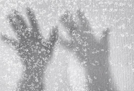
Human Hybrid Art
The following video is a hybrid digital art piece that comprises man-made objects used to produce man-made photographs, which are then digitally manipulated. These digital manipulations are then fed into Ai to generate motion. In this instance the Ai wasn’t given any text input. It was allowed to decide what it thought it was seeing and then animate accordingly. The video includes a mix of the original photographs along with Ai representations and animations from the digital manipulations. This piece is in accordance with my study statement and my search for a new form of human hybrid Ai and digital art mixed.
Everything I Have – Every Sign I See (inspiration from Simon Evans)
I recently came across the work of Simon Evans. He has produced a series of artworks including the pieces ‘Everything I Have’. I particularly liked his idea of recording everyday objects and placing them into a ‘visual list’. Below are two examples of this.


After collecting so many images of signs. I wanted to find an interesting way to display them that would give a sense of the sheer scale of visual noise they produced. Recently, as mentioned above I came across the work of Simon Evans. His simple yet visually arresting pieces ‘Everything I Have’ seems to offer the kind of visual that I was aiming for. Although I have not counted the tiny images above, I suspect that the larger piece contains in excess of a thousand pieces. Even the smaller piece above has at least 350 images. This outweighs the number of signs that I photographed on my visit. Therefore although I wanted to visually list my signs I needed to think carefully how I arranged them. For this reason I decided to create an image block of tiny images surrounded by white space. The thinking behind this was to draw the eye into the frame so that the observer could further explore the tiny details. I also wanted to break away from the image on a white background look created by Simon Evans. I did not wish to copy his work merely take inspiration from it. For this reason I deliberately decided to make my images circular and ensure that there was a lot of white space around the design. Below is my first experiment.
Every Sign I See – Experiment 1.

Every Sign I See – Experiment 1. Landscape

Every Sign I See – Experiment 2. Landscape

Every Sign I See – Experiment 3. Landscape

Less Regimented
After analysing the work by Simon Evans ‘Everything I Have’, I noticed that the tiny images on his piece appear to be less rigidly laid out than in my experiments above. For this reason I decided upon two further developments. I redid the ‘Every Sign I See’ experiment so that the signs were placed freehand into their respective lines. This gave a much more casual appearance to the work. I also decided to add a shadow behind each sign so that it stood out a little from the background. Below is the result from that experiment. I feel that in many ways this experiment works better thqt the more regimented versions above.

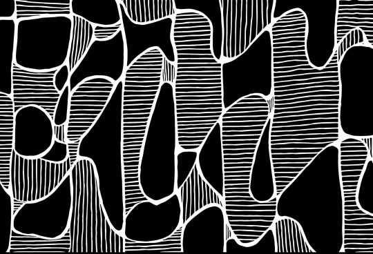
Every Sign I See – Experiment 4. Vector Shapes from Sign Colours
After producing the sign images I decided to run them through a vector making program called Vectornator. I wanted to see how the software interpreted the colours extracted from the sign images. Below is a before and after image. I particularly liked the effect.


Every Sign I See – Experiment 5. Vector Shapes From Sign Colours

Every Sign I See – Experiment 6. Layered Vectors Made from Signs

Every Sign I See – Further Experimentation
The following are digitally manipulated images of the vector images derived from the 300 initial sign images.