Affairs of the Heart –
In my last post about the Grotto print project, I mentioned that I was becoming increasingly unsure about the clocks project. Therefore I asked my friends on Facebook for help. In some sense I wished that I hadn’t bothered because unfortunately it just further confused the matter.
Below are the choices I gave to my Facebook Friends.
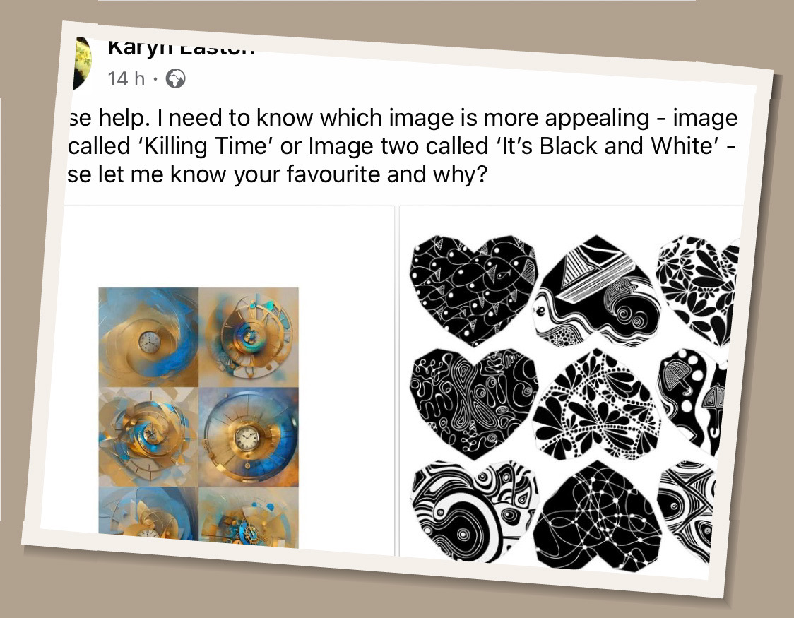
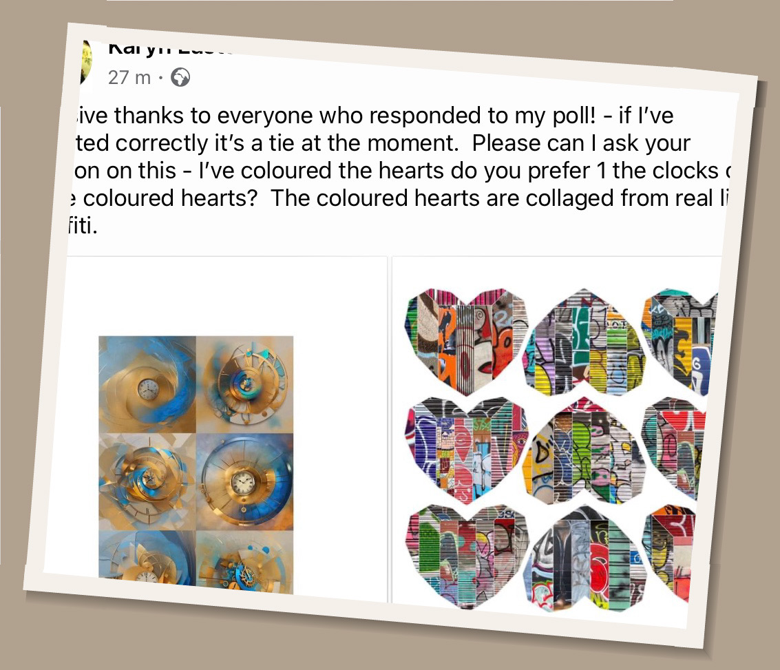
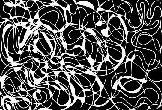
So far not many people have commented on the second set of options with the coloured graffiti hearts. However, for the first set of options namely the colourful clocks vs the black patterned hearts, it was an absolute tie. Over 16 people responded and the comments indicated that those who liked the clocks really liked them and those who loved the black hearts really loved them!
I just don’t know which to choose. Personally I am torn between all three of them. I don’t really feel that the clocks are fully mine even though I had quite a hand in generating them from one of my own images. The graffiti hearts are quite busy and vibrant and although the photography, collaging, design and layout are all mine, they do incorporate elements of other artists’ work.
The black and white designs are all mine but whereas some of my friends really liked them, some also really hated them. One Facebook friend commented that she found the stark black and white contrast too busy and jarring.
What do I do? At the moment I’m still leaning towards the clocks. However, this could so easily change. Maybe I get all three printed and then decide?
Gallery of 3 Potential Images